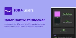
Color contrast checker
Enter your text color and background color below to see if your color combination is accessible and compliant for those with visual impairments.
4 Steps for Color Contrast Checker
Choose Text Color
Select or enter the foreground (text) color you want to test.
Choose Background Color
Pick or enter the background color for comparison.
Check Contrast
Click the button to instantly calculate the contrast ratio.
View Results
See if your colors meet WCAG AA or AAA accessibility standards.
Website Accessibility Checklist
A Color Contrast Checker is an online tool that measures the contrast ratio between text and background colors. It helps designers, developers, and content creators ensure readability and accessibility for all users, including those with visual impairments.


Why is Color Contrast Important?
Proper color contrast improves readability, enhances user experience, and ensures compliance with WCAG accessibility standards. Without enough contrast, text may be hard to read, leading to poor usability and accessibility issues.
Frequently Asked Questions
What Our Users Say
“This tool saved me hours of guesswork. I checked my website colors and instantly knew which ones passed WCAG standards.”
“Super easy to use! Just entered my HEX codes and got results right away. Perfect for web designers.”
“I like how fast it works and that it supports multiple color formats. Would love a feature to suggest better contrast colors.”


